Sunday, 23 December 2012

A Sleek Super Car On My Wrist - Dievas Shadow


My interest in stealth-themed watches began only recently. It started with the purchase of the Lum-tec V3, followed by a simple Seiko SSA051K1. But the Shadow is a different breed of animal altogether. It somehow reminds me of a super car. A Ferrari 599. Where the traditional sexy curves are mated successfully with industrial clean lines and sharp angles.

This watch was launched by Gnomon in Singapore in late September or early october 2012, if I recall correctly, in conjunction with Gnomon's 10th anniversary. Anders got a group of his regular clients together for the occasion. No one paid much attention to Anders, the food, the booze (which wasn't much anyway). It was after he noticed that most of us were staring at him with daggers in our gazes, that he finally decided to show us the watch before we proceeded with dinner.

What's the fuss about this watch? Here we go...


Firstly, the Shadow is pretty much the successor to the Reaper that was released as a limited edition of 50 pieces. I reckon the Shadow could well be regarded as the successor. Gnomon did not exactly tout this as a LE model but did stress that only 150 units will be produced.

There are some noticeable differences between the two models:
1) Size - Shadow : 45mm, Reaper : 42mm.
2) The crown position.
3) Date numerals.
4) Dial markers.
5) Bezel.
6) Crystal.
 Just to name a few.


The reaper comes in a matte black case, boasting Dievas' proprietary 6Steel technology. In a nutshell, it's a tough layer of coating that is 6 times more resistant to scratches and corrosion than normal steel. To up the ante further, it receives an additional plasma layer, making it even tougher. The uni-directional bezel is treated with 6Steel technology.

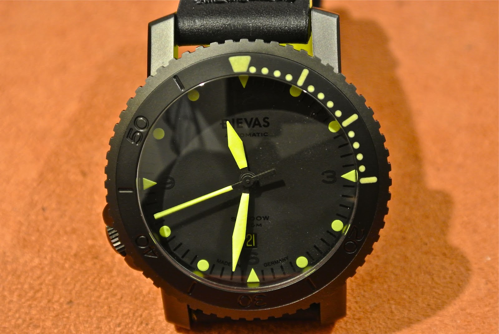
The blacked-out dial reveals reveals some subtle secrets when admired upon from the correct perspective. E.g. the Dievas brand, minute stick markers, Arabic numerals at 12, 3, 6 and 9 and the model name. The Arabic numerals (3,6,9,12) are laid down in a different shade of black, and so are the minute stick markers wedged between each brightly coloured yellow round hour marker. The numerals on the date disc are also stenciled in yellow. 


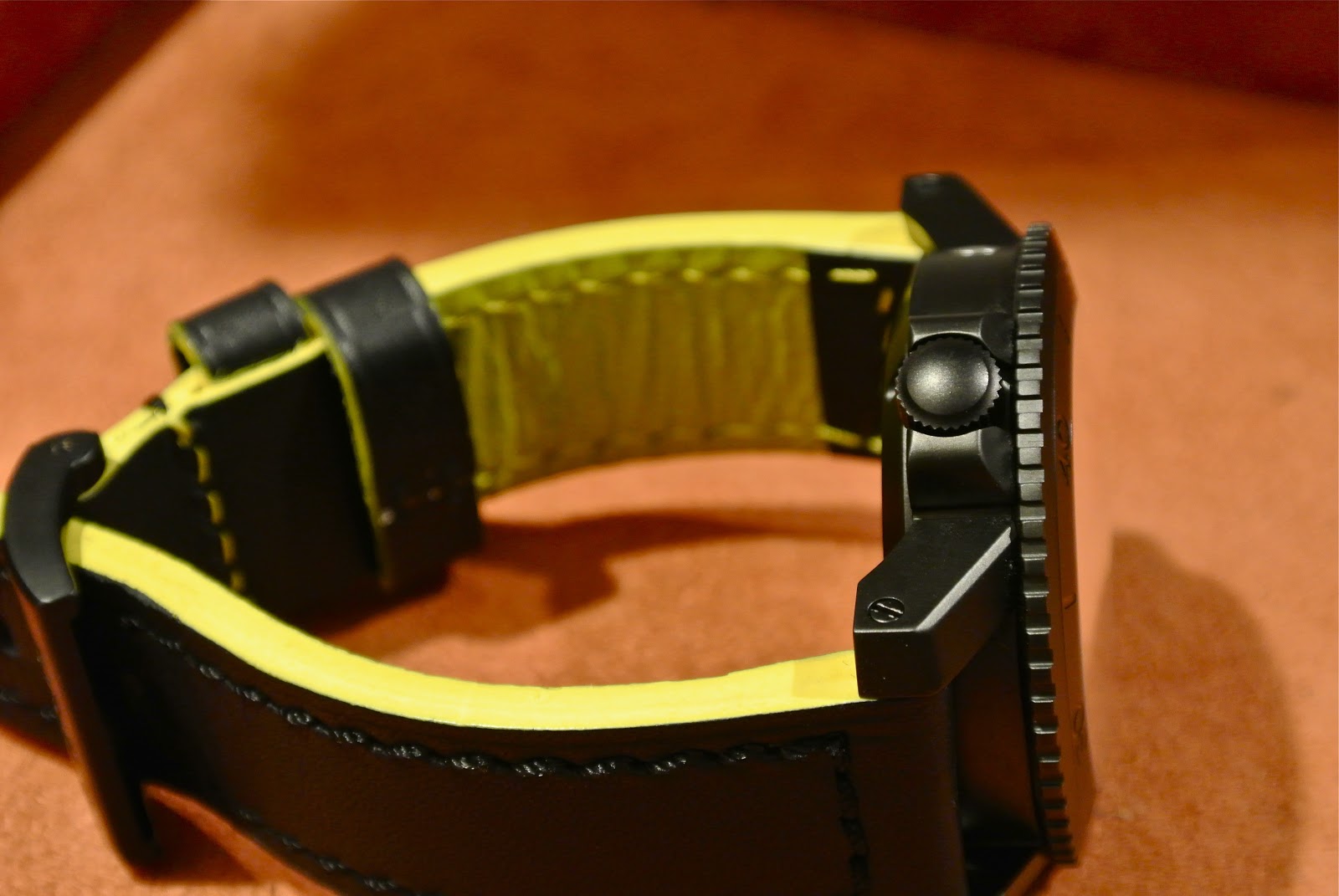
The case is mated to a pair of steeply angled lugs with screwed-in lugs. My first two gripes come from the crown. 

Gripe No.1 - the position of the crown makes it difficult for a simpleton like me to set and wind the the watch. As most of my watches have 3 o'clock crowns, I have to flip my Shadow upside down to attend to these activities. 

Gripe No. 2 - the rather huge bezel coupled with the crown guards, make screwing down the crown a relatively difficult task for a stubby-fingered simpleton like yours truely. But that said, I must admit that it's more comfortable for the wrist as there's nothing eating into my flesh at the back of my flabby hands.

The HEV is located at the 10 o'clock position but unlike the Breitling Avenger Seawolf Blacksteel that I reviewed recently, retains its original stainless steel appearance. I'm okay with it but some might find it an eyesore.


Superluminova is applied on the top right quadrant of the bezel. The alignment seems to be alright but appears to be a just a wee tad out of alignment but it's not a deal breaker for me. The bezel completes a full rotation in 60 loud but dull clicks. There's almost zero free play. A good sign for me.


The domed sapphire crystal further adds to the aesthetic appeal of this avant-garde piece. Again, a good blend of old and new. However, I don't think it has any anti-reflective coating applied on it as it is extremely reflective. Once again, reminding me of a cool super car with tinted, reflective windows and windshields.


The screw-down case back has a brushed polish centre with the usual specs engraved on the circumference and is bordered by a matte rim.


The lume is simple yet effective. pretty bright imho and lasts rather long as well. the lume on the bezel is a couple of shades duller than those on the dial.


The package comes with a pair of case-hugging black rubber straps and a pair of bright yellow leather straps with contrasting black stitch. I've fitted mine with the Reaper's full front black leather. I've opted to limit the use of the yellow straps as I'm concerned that it might soil easily.


The yellow straps are fitted with a signed Dievas buckle. The buckle is actually pretty unusual. It has a very short tongue. but it locks the strap in place confidently.


The black rubber straps are fitted with a signed Dievas deployant buckle. The buckle feels a tad stiff. Maybe its because it's still new. It's difficult to click it back on and one needs to depress the release catch to clip it in place.


My third main gripe with this watch lies with the strap - it's a lint magnet! However, it's really comfortable to use. A word of caution, though, those with smaller wrists might see huge gaps between the straps and your wrists as the straight lugs and case-contoured straps push the straps out much farther. Thus the straps might appear to be bulging out. One way to overcome this is to switch to Nato or leather straps.


The buckle comes with the requisite diver's extension. It snaps open with minimal effort and clips back in place easily. 


How does this sleek 45mm feel on my wrist? Well, Very comfortable. Although the lugs are straight, they are angled just enough to fit the contours of my 6 3/4-inch wrist just right. I reckon it helps that I have a rather huge hand hahaha!

I really like this piece. It's more a casual watch than one you can pull off in shirt sleeves from Monday to Friday.  I really dig the sleek design and the successful mesh of old (traditional) and avant-garde influence on this watch. Well, I guess this is the closest I'll ever come to owning a super car with moving gears in it.

The more I look at it, the more I can't help thinking I have a sleek super car strapped to my wrist. 


Specs:
Case : 45mm.
Lugs : 22mm.
Movement: ETA 2824-2.
Crystal : Domed Sapphire.
Bezel : Uni-directional. Blackened 6Steel.
Power reserve : +/- 42 hours.

Pros:
- Aesthetically pleasing, avant-garde design.
- Reliable movement.
- Scratch resistant case.
- Great lume.
- Clear and clean dial layout.
- Angled lugs.
- Destro (left-hand) crown.
- Matching yellow straps.
- very secure delpoyant buckle.

Cons:
- Crown is difficult to screw-down because of the huge bezel and crown guards.
- Destro (left-hand) crown.
- Rubber straps attract lint.
- Loud yellow straps that could soil easily.
- No anti-reflective coating on the sapphire crystal.

Thanks for reading. Comments appreciated.
Wednesday, 19 December 2012

A Family Reviewed - The Squale 20 ATMOS 1545


It's been a rather interesting 1 and a half months for me, no thanks to Gnomon and Squale. For those of you who have been following my posts on WUS and my reviews on the Squale 20 ATMOS, you can probably gauge my interest in this line-up from Squale. A total of five, well, ok, five and a half or 5 + 1 models were introduced to date, with the first released on 2-Nov 2012.

As this rather memorable year draws to a close, I am rather doubtful that the Squale and Gnomon will be planning any new releases for this range for now. Anders looks like he needs a breather really, really bad. Therefore, I reckon it's apt that we should do a review and a recap of this range. Yes, I'll be doing a review of the latest offering - the DLC Classic in this post.


For the uninitiated, I'll just do a quick run down of the range, to date, with reference to the picture above (from left to right). First on the left, we have the Vintage, which was released together with the first release Classic on 2-Nov 2012. Next, we have the second release Classic. The third, and possibly the most popular model to hit the showroom is the Root Beer. The fourth is the Maxi and the latest and last of the line up, at least for now, is the DLC.

I've given some of them personal nicknames for easy reference. I've been referring to the first release Classic as the "Classico", the second release as the "Classic", the Root Beer, sometimes as the "Brownie or Redhead", and the DLC as the "Golliwog".


Why call it the Golliwog? I don't know about you but I see a slight resemblance. The shark logo at the bottom enhances it, imho. I hope no one is offended by this reference as there isn't any racist implications or intentions in my reference at all. For the record, I've always liked the Golliwog since I was a kid.

Now, let's talk about these watches.

General Overview


As you can see from the pics, I do not have the Classico as they have been completely sold out, like the Vintage. I'm beating myself for not getting one when it was offered to me. Anyway, here're some generic facts about these 5 + 1.

Firstly, they all come in 40mm cases. The bracelets are tapered from 20mm-18mm. The bezel completes a full circle in 120 crisp clicks. There's hardly any free play so it's rather reassuring. Each click locks the bezel firmly into place.


The cyclops date window offers a 2.5x magnification and does a pretty decent job, unlike those on Steinhart's Ocean range which makes the magnifier seem more like a boob job that was not worth the effort. Pardon the comparison.


The screw-down crown is very reassuring and takes 5-7 turns to complete the lock-down and sequence.  Furthermore, the threads are hidden from view. It's probably located at the top of the stem housing.


These watches come with diver's extensions. The later releases have extensions that look more modern. the Golliwog has DLC coated extensions as well. The Vintage and Classico models have more utilitarian looking extensions.

Another major difference is that the models released after the Vintage and Classico are fitted with screwed-in link bracelets while the former are fitted with split pin links.


Another difference is the clasp. The twin-lock clasps on the screwed-in links have the logo on the main clasp. Even the Golliwog has it nicely etched on it. While the earlier models fitted with split pin links have the logo on the secondary locking clasp.

I personally prefer the clasp on the Vintage and Classico as they are easier to remove. Unclipping the clasp on the later models is literally a nail-breaking experience. The end of the clasp seems to be bent further inward then the earlier models'.


The case backs of the first two models and the later 3 are also drastically diffeent. The earlier models (Vintage and Classico) have polished case backs with the Squale logo imprinted on it while the latter models have a burnished centre case back with serial number indicated on it.


Lume ranges from mediocre to average at best. But depends on the model.

The Individual Scrutiny

The main difference between each model is the dial. As such, the following section will focus mainly on this.

The Golden Oldie - The Vintage


This is the one I like most after the Root Beer. It uses a NOS (New Old Stock) dial and production is limited to a mere 20 or 30 pieces. This was launched with the Classico and was sold out within a few days of launch. The vintage look of this piece is unmistakable. The gilt markers and hands harks back to the glory days when the glitter of gold adds a certain level of classiness to the goods in question, particularly a timepiece.

As a testament to it's popularity, I have received 3 offers for my Vintage on 2 forums. The first two offers were received within a week of my purchase.

The Queen of the Pack - The Root Beer


Next, is my absolute fave - the Root Beer aka Brownie. This redhead stunner is easily the most popular of the range. The first batch of this sold out faster than the Vintage. Words can never describe it's beauty adequately. It's an absolute visual feast. It attracts attention like moths to a fire. It's not loud but yet attracts praises by the truckloads.

The Big-Eyed Boy - The Maxi


Firstly, the markers. They appear bigger than the rest of the range. This is because of the white borders surrounding them. The other unique feature is the colour of the dial. It's charcoal-grey hue swings hints at it's vintage inspiration. This, imho, is the most masculine in my collection. It's subtle yet bold at the same time. The colour of the dial is not that obvious until you place it next to a Classic.

A Classical Offering - The Classico and the Classic


I'd like to apologise for two things. Firstly, the pic above is very different from the earlier ones and the one to follow later because I had borrowed this watch from Anders for this review last week and I have since returned this to him. In case you're wondering why I have kept the plastic wrappers on the watch. Well, this is a loan set from Gnomon and I'm obliged to treat it with the utmost TLC.  Secondly, I do not have any pic of the Classic to place alongside the Classico as Anders is completely stocked-out of it. Once again, my apologies.

I personally prefer the more serious, professional and grown-up look of the Classico. This is enhanced by the line of text above the 6 o'clock position. The design gurus at Squale have replaced the lines of text with the company logo. I personally feel that this is unnecessarily excessive. I feel that they have made the watch a little more casual with this approach.

The Golliwog - Classic DLC


The nickname Golliwog came to mind as just a couple of hours ago and this is explained earlier in the review. But to be honest, Stealth would have been a befitting nickname as well. I will attempt to spend more time on this piece as this has yet to be reviewed.

As it's all black, it looks rather small compared to it's stainless steel siblings. However, it feels a tad heavier than it's siblings. Probably due to the DLC coating? It also looks a bit chunkier from certain angles.


As its official name suggests, it uses the same dial as the Classic. Special mention has to be made about the coating. Comparing it against Steinhart's offering, I reckon this looks much better than Steinhart's. Surfaces are really smooth. The highly polished black surface of the case is satin-like visually.


My biggest gripe about this watch is the exposed, uncoated end at the clasp. This sticks out like a sore thumb thanks to it's black surface.

I recently discovered that Davosa has a similar range of watches in their Ternos Diver range. However, they are priced at almost doublt the sisze of the Maxi.

More pics for your viewing pleasure.


Specs:
Case : 40mm
Lugs : 20mm
Movement : ETA 2824-2
Variants : Vintage, Classico, Classic, Root Beer, Maxi and DLC

Pros:
- Price, affordability.
- Good finishing.
- Reliable movement.
- Beautiful Dial (Root Beer).
- Huge demand. Easy to get on at bargain basement prices.

Cons:
- tight clasp that is hard to remove.
- Screw-in crown - takes 5/6 turns to completely screw down.
- Casual/ kiddish looking dial with two logos on the dial.
- Huge demand- even on the pre-owner market.
- Links are pretty hard to remove braselet link as too much loctite was used.
- Weak to average lume.

Saturday, 15 December 2012

My First Taste of Bronze - Steinhart Marine Chronograph Edizione Limitada Bronzo


When I found out that Steinhart had just released a limited edition bronze watch, I contacted Gnomon immediately. However, the reply I got from Anders was far from encouraging. "We've only been allocated very limited pieces, bro. And most of them have been allocated to customers already. But "our dear friend" is at the head of the line," he winked. So I resigned myself to fate.

Fast forward to today. I decided to drop by Gnomon as the missus wants to go Christmas shopping. And honestly, I hate going shopping with her. It's a nightmare! Anyways, that's another kettle of fish altogether. So, there I was sitting at the counter chatting with them Gnomon team when in popped "our dear friend". He was also taking time off from the missus and decided to come view and possibly collect his Bronzo. So, I asked if her could lend it to me for the weekend to do a quick review and he obliged.

Alrighty then, on with the bronzo...


For the uninitiated, this is a limited edition piece of 55 pieces worldwide. And this piece on hand is an auspicious sounding #38/55. The 48mm bronze case is fixed to a tachymeter-scaled bezel. Under the sapphire crystal is a moss-green sandwich dial with sub-dials at the 9 and 3 o'clock positions. The hands are gold stained.

The case is amazingly attractive and gleams with differing shades of gold depending on the lighting condition.


The crown and pushers are bronze as well. The Steinhart logo is engraved onto the crown and painted over in blue. Unfortunately, this is not properly done and the end result is an unevenly painted surface.

The crystal is also slightly domed to add to the vintage visage. The lugs extends quite a fair bit but dip down sufficiently but is slightly angled.


Visible through the see-through case back is the Valjoux 7753 movement. The model, material used etc are engraved on the circumference of the stainless steel case back.


The limited edition numbering is engraved on the bottom lug space. This generously sized bronze beauty is proportionately mated to a pair of 26mm lugs.


This beautiful beast is mated to a pair of vintage looking brown straps with olive green stitch to match the dial. The longer strap comes to an angled stop with the limited edition embossed braking just in time at the 22mm tapered end.


A bronze tang buckle and a thick floater completes the visually pleasing straps.


The long lugs make the watch look kind of big on my 6 3/4-inch wrist. However, it sits rather comfortably and is not very heavy.


The lume is impressively bright and pretty. The sandwich dial is indeed the right choice.


To be honest, I have never really been a bronze watch fan. firstly, I'm not sure if I will like the patina years down the road. Secondly, I was told that bronze cases are not as sturdy and hardy as stainless steel. And it doesn't help that I tend to ding and scuff my watches with absolute ease.

The other thing I can't understand is the absence of a date window. It's a Valjoux 7753 anyway.

This is easily one of the most expensive Steinhart I have ever come across. This looks like a keeper. I am doubtful many will work its way into the pre-owned market. Many owners, will undoubtedly, want to see how the patina will develop over the years.

However, the past few hours of constantly and careful scrutinizing the watch, I've grown to really like it.

I'm seriously contemplating not returning this piece to "our dear friend" and keep it on my wrist for good!

Pros:
- Impressive size (48mm).
- Colour changes according to different lighting conditions.
- A conversational piece.
- Very well designed and constructed.
- Beautiful matching straps.
- Brilliant lume. Very pretty.
- Sandwich dial.
- Rarity.

Cons:
- Rarity.
- Blue paint on crown not evenly applied.
- Not as sturdy and hardy as stainless steel.
- No date window.
- relatively expensive.